art direction, brand
Branding – Guggenheim Museum Rebranding 2019
Branding – Guggenheim Museum Rebranding 2019
By Miklós Kiss
ABOUT REBRANDING PROJECT
Abbott Miller’s firm designed the Guggenheim identity in 1997 based on the Wright-inspired lettering sign on the building’s façade. Miller collaborated with Jonathan Hoefler, who created the typeface from the sign and named the new font family Verlag.
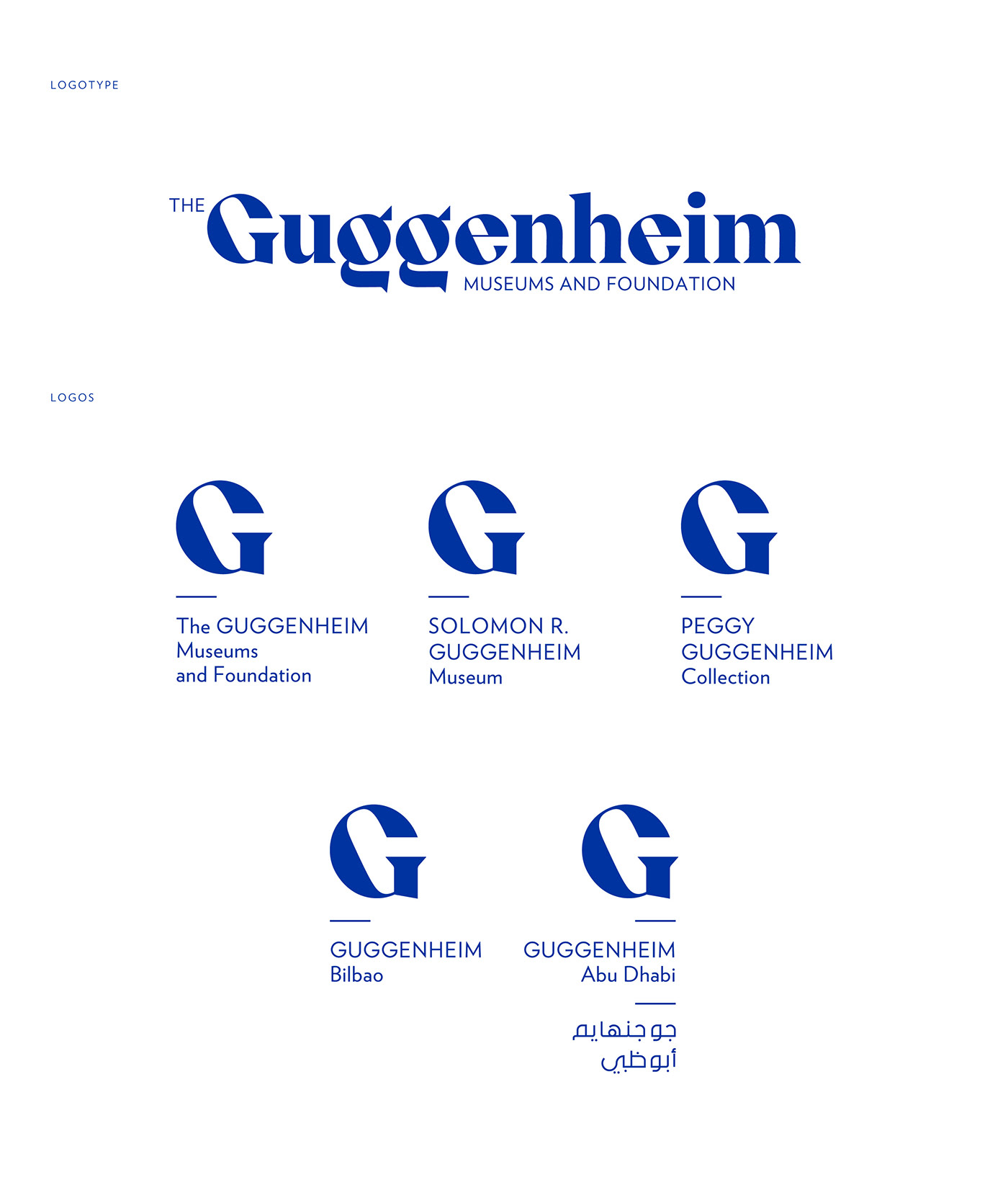
Miller’s new logotype for Guggenheim was almost entirely based on Verlag. The only tiny difference is the letter G.
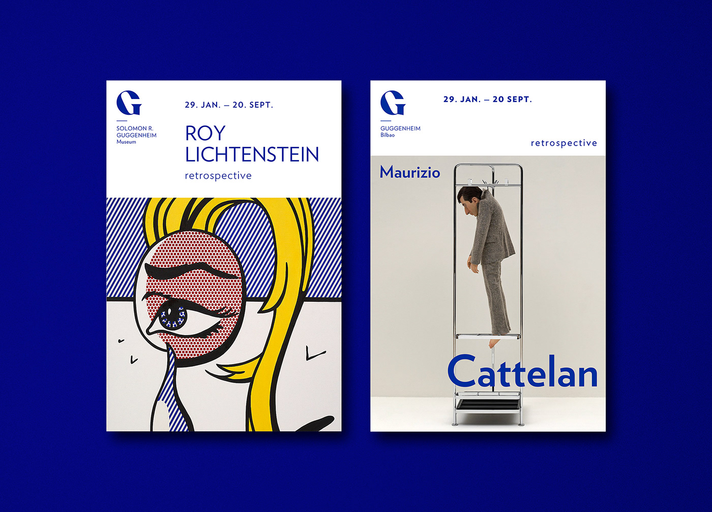
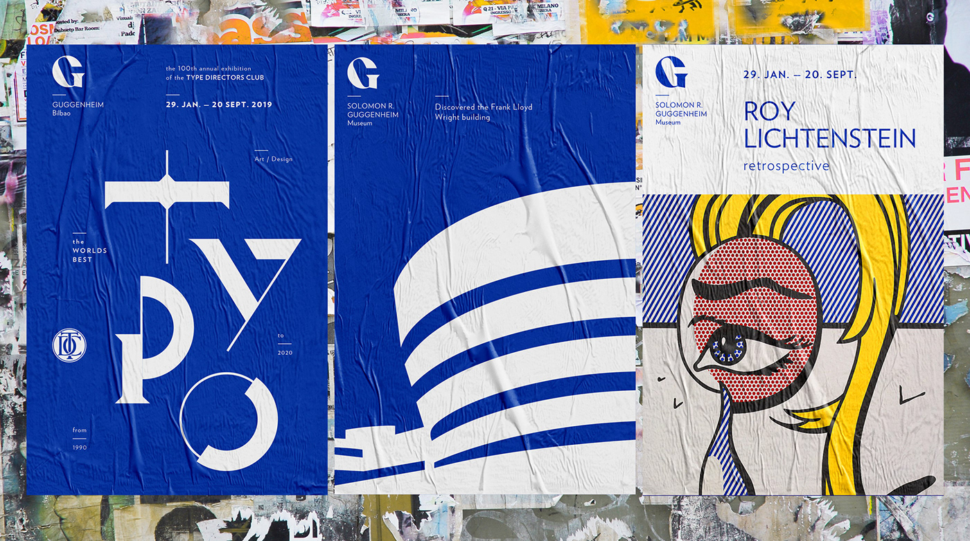
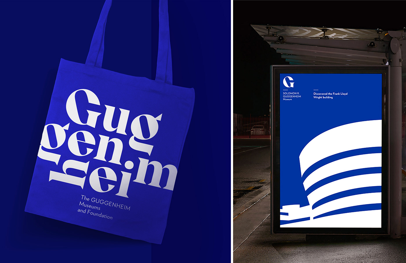
I think Verlag is a brilliant typeface, but I also believe Guggenheim Museums and Foundation could use a more iconic logo which is contemporary, innovative and timeless and at the same time fits with Guggenheim’s architectural traditions.
So I imagined a new logo and identity for Guggenheim, the temple of modern art.
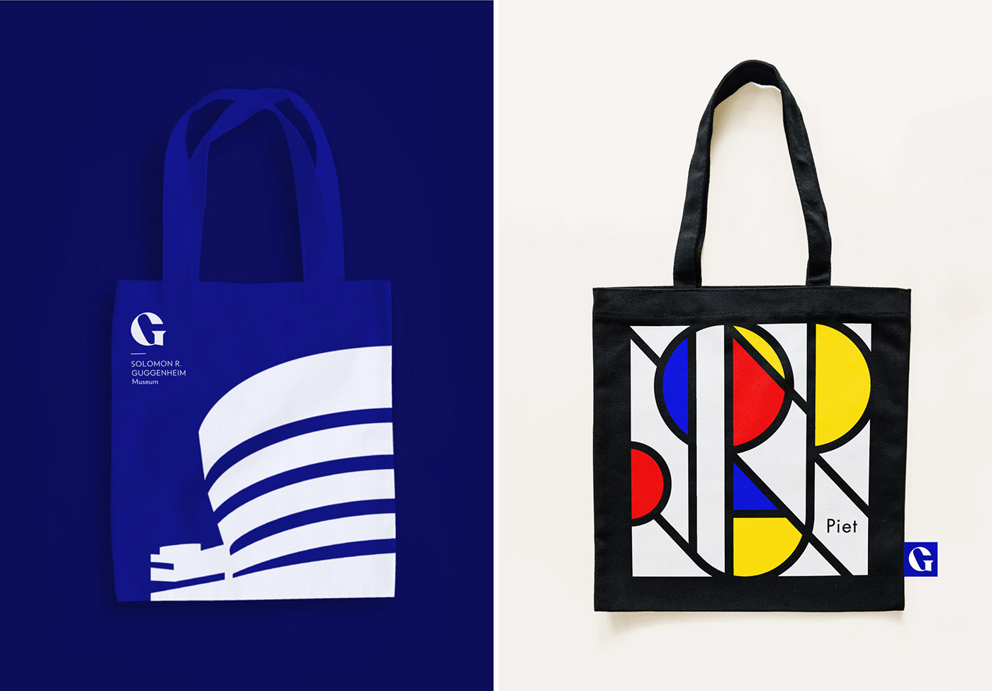
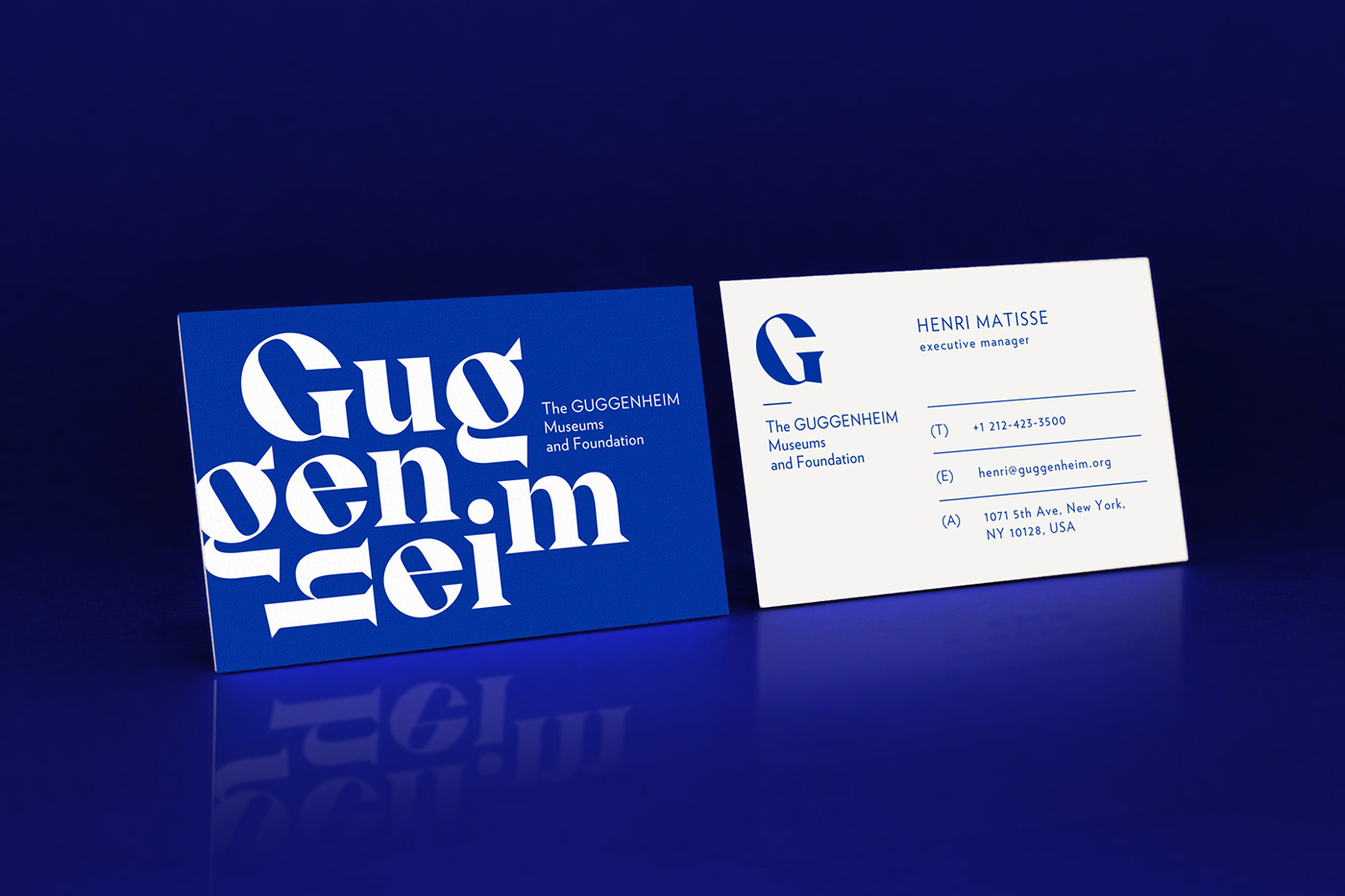
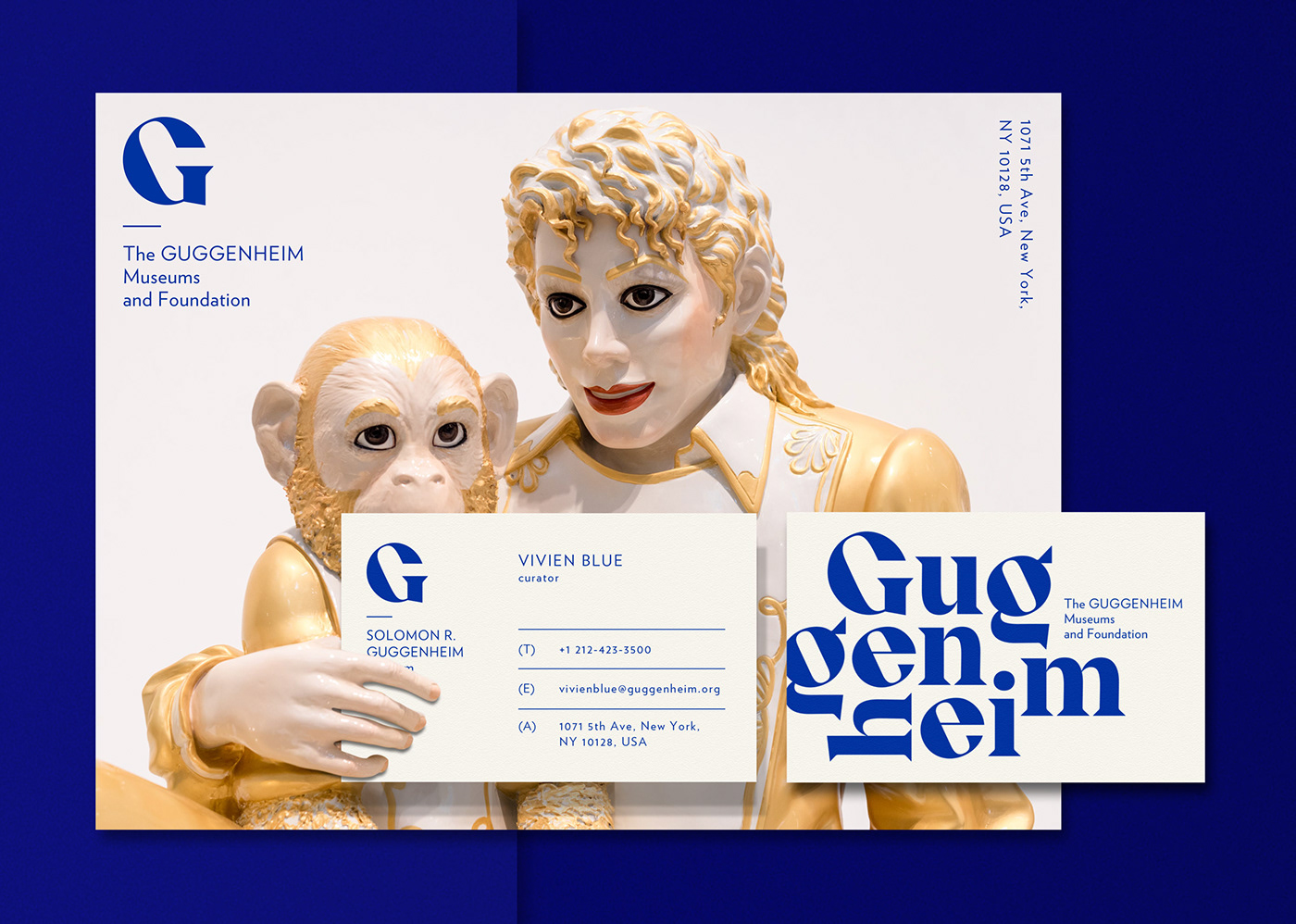
My logo is not based on Verlag, however I kept it as the main font in the identity switching the ‘G’ to Miller’s ‘G’ as hint of continuity.
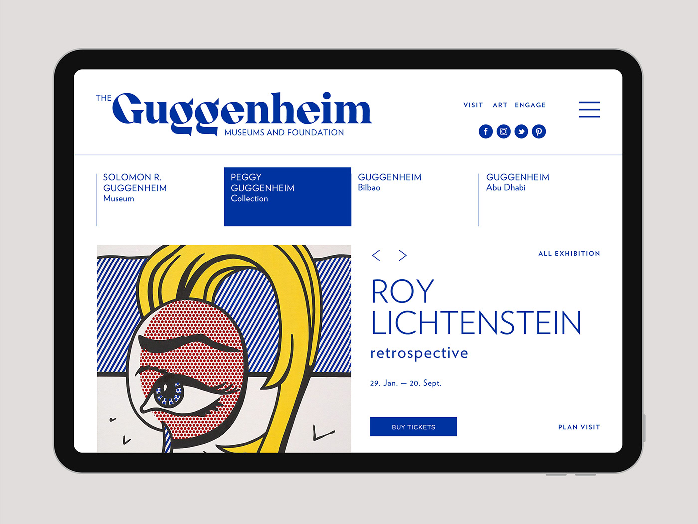
The identity is completed with silhouettes of the landmark Guggenheim building’s which I also believe is central to the Guggenheim’s great brand.
The main colour is Yves Klein International Blue as a reference to Guggenheim Bilbao’s iconic Pool from Yves Klein.

About Miklós Kiss
Miklós Kiss’s works incorporate various facets of architecture, fine art, design, and graphic design. A strong artistic approach and outstanding aesthetic quality characterize his art. His fine art pieces are just as significant as his distinctive style in corporate identity and graphic designs.